前回の続き
前回の続きです。
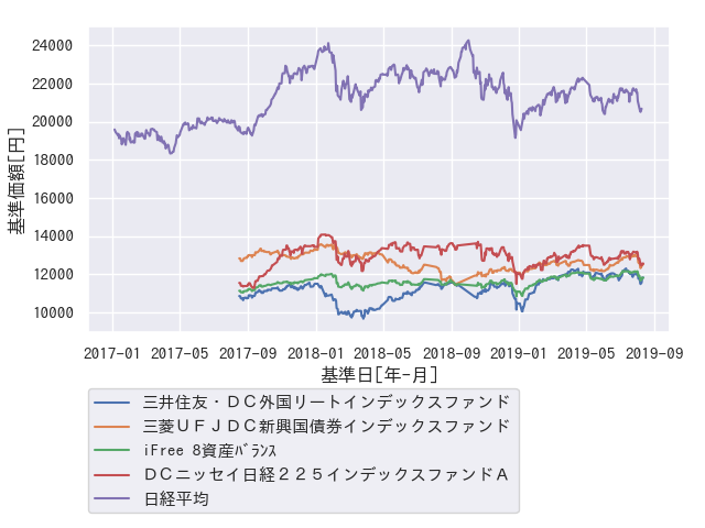
折れ線グラフ
まずは折れ線グラフを描画したいと思います。
描画するのは以下です。
- 運用商品(4つ)
- 日経平均
以下で起動します。引数(dataset-2017-20190812)は、運用商品のデータ(CSV)が入っています。
$ pipenv run python3 seaborn_graph_with_nikkei.py dataset-2017-20190812/
折れ線グラフ(seaborn_graph_with_nikkei.py)の中心処理が以下です。
plt.figure()
# グラフ描画
for product_name in ['三井住友・DC外国リートインデックスファンド',
                     '三菱UFJDC新興国債券インデックスファンド',
                     'iFree 8資産バランス',
                     'DCニッセイ日経225インデックスファンドA']:
    set_df_graph(product_name, adf)
nikkei_df = get_nikkei_df()
sns.lineplot(x=nikkei_df['x'], y=nikkei_df['y'], label='日経平均')

# グラフ設定
ax = plt.gca()
ax.set(xlabel='基準日[年-月]', ylabel='基準価額[円]')

# 余白設定
plt.subplots_adjust(top=0.95, right=0.95, bottom=0.37)
# 凡例を外側に設定
plt.legend(bbox_to_anchor=(0, -0.18), loc='upper left',
           borderaxespad=0, fontsize=11)

plt.savefig("seaborn_graph_with_nikkei.png")
plt.close('all')
以下で各折れ線グラフを描画しています。
sns.lineplot(x=nikkei_df['x'], y=nikkei_df['y'], label='日経平均')
画像の上下左右を変更したり、凡例を下に置く設定が以下です。
# 余白設定
plt.subplots_adjust(top=0.95, right=0.95, bottom=0.37)
# 凡例を外側に設定
plt.legend(bbox_to_anchor=(0, -0.18), loc='upper left',
           borderaxespad=0, fontsize=11)
画像は以下です。
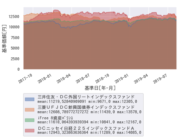
面グラフ(Area Chart)
折れ線グラフに加え、線に囲まれたところを色付けするグラフです。
積み上げグラフ(stackgraph)との違いは、データを合計するかしないか、が違います。
ここでは単なる面グラフを描画します。あと、凡例(Legend)に平均等を表示を追加しました。
描画するのは、運用商品(4つ)にしました。日経平均を描画してしまうと、
全部埋まってしまいそうなので割愛しました。
面グラフのサンプル(seaborn_area_chart_with_outlegend.py)の中心処理が以下です。
plt.figure()
# グラフ描画
product_names = ['三井住友・DC外国リートインデックスファンド',
                 '三菱UFJDC新興国債券インデックスファンド',
                 'iFree 8資産バランス',
                 'DCニッセイ日経225インデックスファンドA']
product_dt = None # 基準日
product_prices_df = pd.DataFrame()
# (1)
for product_name in product_names:
    # 各columnの商品名毎のデータを取り出す
    product_df = get_df_graph(product_name, adf)
    # 基準日を設定する
    if not '基準日' in product_prices_df.columns:
        product_prices_df['基準日'] = product_df['基準日'].values
    product_prices_df[product_name] = product_df['基準価額'].values

# print(product_prices_df.head())
# 以下データ
#   三井住友・DC外国リートインデックスファンド  三菱UFJDC新興国債券インデックスファンド  iFree 8資産バランス  DCニッセイ日経225インデックスファンドA        基準日
#   0                 11393.0                 13578.0         12001.0                 14076.0 2018-01-10
#   1                 10130.0                 13111.0         11372.0                 12591.0 2018-03-30
#   2                 11096.0                 12114.0         11453.0                 13269.0 2018-06-29
#   3                 11063.0                 13149.0         11312.0                 11661.0 2017-09-18
#   4                 10680.0                 12159.0         11252.0                 12243.0 2019-01-13
# 基準日をx軸にして、stackしない設定。
# stackとは、積み上げグラフを指す
# (2)
product_prices_df.plot.area(x='基準日', stacked=False)

# グラフ設定
ax = plt.gca()
ax.set(xlabel='基準日[年-月]', ylabel='基準価額[円]')

# 余白設定
plt.subplots_adjust(top=0.95, right=0.95, bottom=0.50)
# 凡例を外側に設定
lg = plt.legend(bbox_to_anchor=(0, -0.38), loc='upper left',
           borderaxespad=0, fontsize=11)
# (3)
for lg_text in lg.get_texts():
    text = lg_text.get_text()
    mean = product_prices_df[text].mean()
    min = product_prices_df[text].min()
    max = product_prices_df[text].max()
    lg_text.set_text(text + "\nmean:{} min:{} max:{}".format(mean, min, max))
plt.savefig("seaborn_area_chart_add_legend.png")
plt.close('all')
上記は以下の処理を行っています。
- (1) グラフ用DataFrame生成
- (2) 面グラフ描画
- (3) 凡例に平均値追加
特に、(2) 面グラフをどう描画するのか、いろいろ調査した結果、こうなりました。 積み上げグラフならば、stackplotとかもあるようです。
起動方法は以下です。
$ pipenv run python3 seaborn_area_chart_with_outlegend.py dataset-2017-20190812/
画像は以下の通りです。
おわりに
途中少し詰まることもありましたが、思ったよりあっさりと描画できました。
仕事に生かしていきたいと思います。
参考
- MatplotlibのAPI
https://matplotlib.org/3.1.1/api/legend_api.html - savefigの解像度設定
https://codeday.me/jp/qa/20190122/143899.html - area chartの例
https://python-graph-gallery.com/254-pandas-stacked-area-chart/ - seabornの基礎。図解されていてわかりやすい
https://towardsdatascience.com/a-step-by-step-guide-for-creating-advanced-python-data-visualizations-with-seaborn-matplotlib-1579d6a1a7d0 - seabornの凡例操作方法
https://stackoverflow.com/questions/47542104/how-to-control-the-legend-in-seaborn-python
https://qiita.com/matsui-k20xx/items/291400ed56a39ed63462 - area chart出力方法
https://pandas.pydata.org/pandas-docs/stable/reference/api/pandas.DataFrame.plot.area.html - エラー出力の参考
https://nextjournal.com/blog/plotting-pandas-prophet - seabornの見た目調整
https://qiita.com/skotaro/items/7fee4dd35c6d42e0ebae